Michy & Francy
Type
Web Application
Category
Multi-vendor E-commerce
Role
UI Designer
UX Designer - Design systems
Live Website

Mrs. Michelle Francis Okafor
Founder @ Michy & Francy
Michy & Francy
Michy & Francy is a multi-vendor storefront where independent beauty sellers list skincare, cosmetics and hair care to shoppers across Nigeria. Every vendor gets a shop of their own inside the marketplace, and every shopper gets one cart, one delivery choice and one payment across all of them. The money is real, the delivery fees differ by thousands of naira, and most of the customers are buying on a phone with a data budget. The job was to make the price a shopper sees on the shelf the same price they pay at the end.
Smart Airs
Category
Website & Management System
The Problem
The price on the shelf was not the price at the end
Product cards quoted a range — N10,000 to N13,000 and the variant, the delivery fee and the coupon each moved the number later. By the time a shopper reached Pay the total had changed four times, and none of those changes had been announced. The most common support message was a screenshot of a product card next to a screenshot of a receipt.
Delivery was a decision made blind
Pickup and door delivery differ by N4,000 on the same order, but the fee only appeared after an address had been selected and the buyer had committed to the step. People chose the option that read as default and found out what it cost on the summary screen.
Every vendor looked like every other vendor
A seller with four products and a seller with four hundred rendered into the same undifferentiated grid. There was no shelf to speak of, no filter that belonged to the vendor, and no reason for a shopper to remember whose shop they had just bought from.
Michy & Francy's Goal
The goal was to make the total honest at every step. Not a disclaimer at the bottom of the page, which shoppers learn to scroll past, but an interface where the number in front of you always includes everything decided so far, and where the thing that is about to change it is visible before you choose it. Everything else followed from that: what a product card is allowed to promise, when a delivery fee appears, where the wallet lives, and how little a returning buyer has to re-enter to get to Pay.
Design process
Understanding what shoppers and vendors each need from the same transaction, auditing the existing checkout against real orders, mapping the flows, designing the screens against a shared system, and testing on the phones and network speeds the customers actually have.
01
Step
Understand
User Research
User Interview
Competitve Analysis
02
Step
Define
User Personas
Empathy Map
User Journey
03
Step
Ideate
User Flow
Information Architecture
04
Step
Design
Wireframe
Hi-Fi Designs
Prototype
05
Step
Test
Feedbacks
Conclusion
Future Concept
Design Approach & Proposed Solution
A walkthrough of the thinking behind the storefront, the five people it was built for, the principles that came out of that, and how those principles decided every screen.
Defining the Problem
Space
Five roles use this console and they want opposite things. A moderator wants speed. A finance admin wants to be slowed down and made to read. A support agent needs a reader's phone number and has no business seeing platform revenue. A content editor needs to hide a series for a rating review without the power to delete it. A super admin needs all of it, plus the ability to decide who gets what.
One interface for all five meant the severity of the action had to drive the design, not the seniority of the person.
Design principles
established for
Michy & Francy
One shelf per vendor, one checkout for the buyer
Each vendor controls their banner, categories and product order, so a shop reads as a shop. Everything after Add to Cart is the marketplace: one cart, one delivery choice, one payment, regardless of how many sellers are in the basket.
Every state an order can be in has a screen
Placed, paid, packed, dispatched, delivered and refunded each have a view a support agent can open and a buyer can be pointed at. No state is inferred from an email, and nothing is described to a customer that they cannot also see.
What this led to
Product cards stopped quoting a range and started quoting the variant in front of you. Both delivery options now sit on the same card with their own fees attached, so the N4,000 difference between pickup and the door is a choice rather than a discovery. The wallet moved into the order summary as a toggle with its balance printed on it, and flipping it moves the total in place. The order summary itemises every line that changed the number, so a shopper watching N60,000 become N40,000 can point at the coupon and the wallet and say why.
Every choice traces back to one of the five users and one of the five principles.
User Task flow
A step-by-step look at how users move through Nabata from entry point to goal,
with no unnecessary detours.
Flow 1
Shopper Flow
From the shelf to the receipt

Low Fidelity Wireframes
A closer look at the screens that define how the Admin's console works from first tap to final transaction.
Featured Screens
A closer look at the screens that define how Igree works from first tap to final transaction.
Vendor
Storfront's Interface
Shopper
Storefront's Interface
Toon Central's Impact
on the Teams Who
Use It
Shoppers
The price on the card is the price of the thing in front of them, and the two delivery fees are visible before either is chosen. The total on the Pay button is the amount that leaves the account.
Vendors
A shop looks like a shop — banner, categories, their own product order — without anyone building a page for them. New sellers go live the day they are approved rather than waiting on a design queue.
Typography
The typeface choices across Igree prioritize readability without sacrificing personality clean enough for commerce, distinct enough to own.

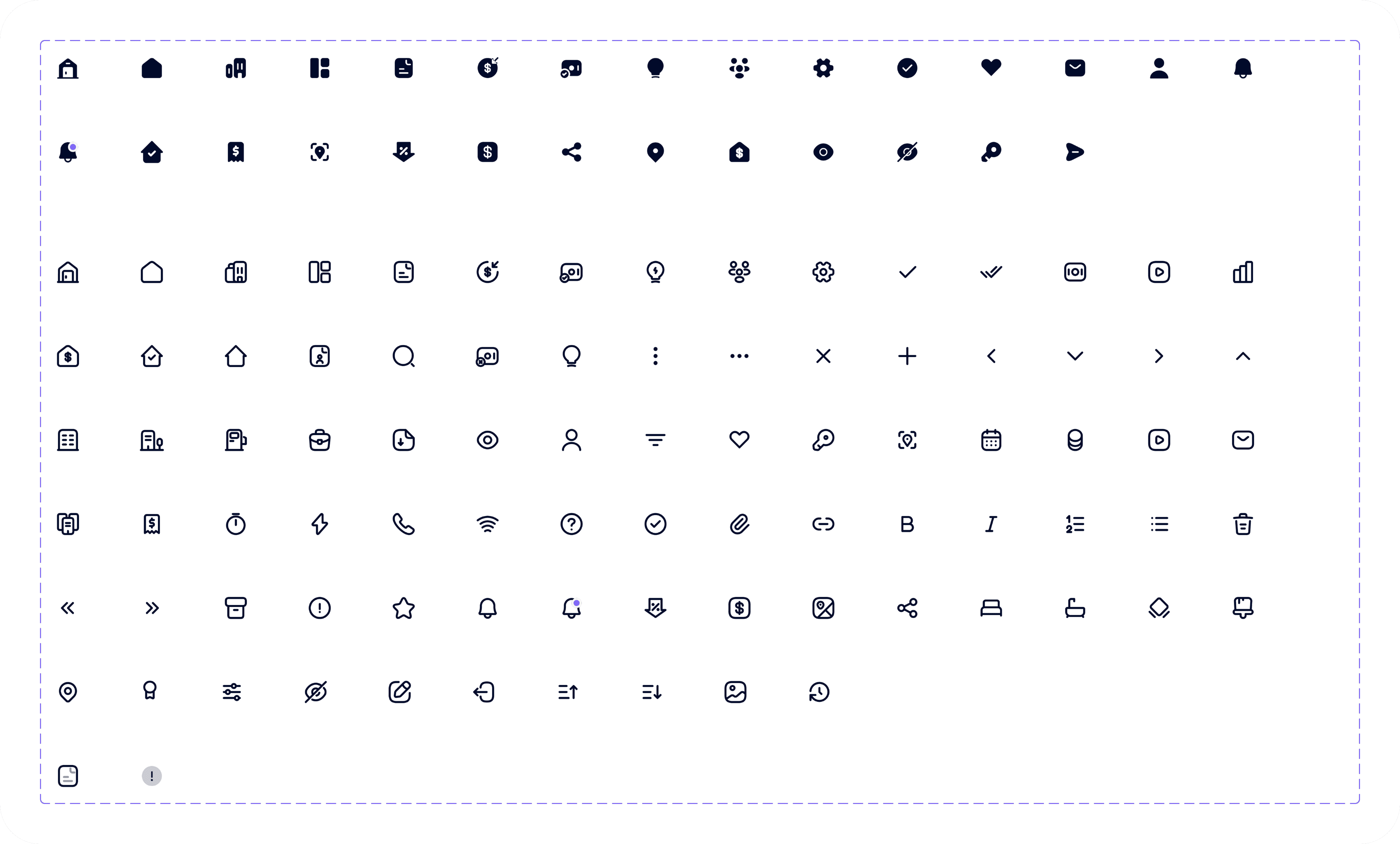
Iconography
Every icon in Igree is built for instant recognition simple enough to read at a glance,
consistent enough to feel like one system.
Management System
Smart Airs
Tax Revenue Collection System
Web Application
Nabata
SaaS Hospitality Website
Explore all projects


Available for Freelance
Back to Top
Available for Freelance
Back to Top
Let’s Create
something extraordinary
together
Let’s make an impact!


Victor C. Nwobodo
UI UX Designer



Contact me
designwithvcn@gmail.com
Hit me up if you’re looking for a fast, reliable UI UX Designer who can bring your vision to life
Designed with ❤️, Logic and a lot of Coffee.
Copyright © Web Design and Development, 2026
Created by
Victor Nwobodo